

Changing a logo is not a decision to be taken lightly by any entity i.e., company or individual. This is because a logo is an identifier of a company, the face of its identity. There has to be a big shift for companies to consider such a drastic change. Amongst others; the reasons for a change could be companies going through mergers, changing their products or services and/or repositioning the brand.
Over the years, companies like Google, Absa, BP, Apple, Delta Airlines, and the most recent at the time of writing this article, Nissan have changed their logos multiple times. Absa changed its brand when it detached from Barclays to be a ‘standalone African Bank’. BP changed its logo to seem more environmentally conscious after the Deepwater Horizon oil spill. Nissan changed their logo to transition better to the digital age.
We are not detaching from anyone. We are not distancing ourselves from a disaster we caused. And we developed the initial brand with digitisation in mind. So, why change?

We can all agree 2020 threw us off. Some people went through barely unscathed. Others were not so fortunate. The emotional turmoil affected millions through the loss of loved ones and loss of income. Companies retrenched employees and others had to close down. We, Chameleon Touch, were affected as well. We saw our revenue dwindle. By the end of the year, it had dried out. We were in the red.
Our survival, like most businesses, depended on change. That could mean changing the services/products offered and/or how the services/products were offered. We were happy with how we offered our services because we are a fully digitally-functional company; quarantine did not affect us. We knew the problem was with our services. Companies were not lining up for design work. We knew something had to change. Hence, we needed to reposition.
Our brand positioning was a halfway split between a design agency and a brand consultancy. The design agency part was more prevalent in our marketing efforts. Hence our target markets saw us as a design agency more than a brand consultancy. Companies we worked with were not looking for new designs, instead, they needed consulting services to save themselves. Branding can help with that, but we did not make it clear we were the right fit. We decided to pivot more on positioning ourselves as brand consultants than as a design agency. This put us in a position to let our clients know we solve bigger problems than just pushing pixels on a computer.
How do we emphasise the knowledge we have beyond pixels? The answer: content marketing. We believe in that sharing our knowledge and experiences will position us as brand experts and help develop more valuable relationships between us and the market we serve. The slight shift in positioning meant we will no longer talk about our wonderful designs directly, but the value of them; and also share what we hope to be brand educational content for entrepreneurs and C-suite executives.
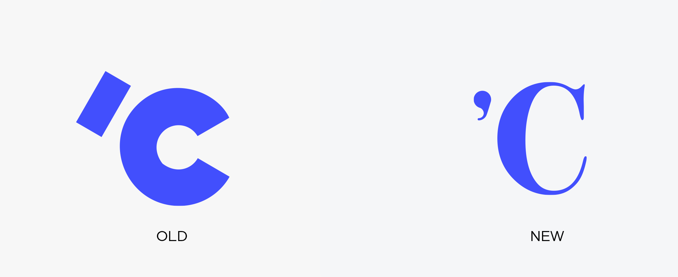
We needed a mark that represents the direction we are taking. A mark that has authority. A mark that speaks to the expansion of our target market from small businesses to medium-to-large companies. We did not want to make a drastic change as our repositioning is not drastic either. We looked at how we can tweak our logo to align with the new brand position of the company. From there on the decision was to change the typeface of our logo from sans-serif to serif.
Over the years serif fonts have ‘represented trustworthiness’. authority and as Sean Paul Lavine puts it: conveys dependability. This may be because books, newspapers and other authoritative writings were written using serif fonts. With the company moving to content-based marketing, we need our target market to trust what we say, find our content dependable and us as authoritative figures in our field.
Our focus on content marketing does not mean we no longer do design work. Brand development, identity design and experience design will always be the output of what we do. How we communicate what we do is what we are changing. We are moving from output conversations to outcome conversations. The benefit you will find is that there will be an influx of free branding content that will help grow your business. Through this we hope to have meaningful conversations with you, resulting in valuable engagements for both of us.
Phathu Nenzhelele is a Co-founder and an Executive Creative Director of Chameleon Touch. He has a combined experience of 10 years in branding, experience design and visual design. He is also a design content creator through short posts and full-length articles such as Let yourself be bored on Medium.