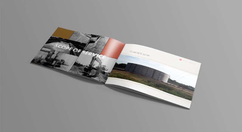
RTCO Group is a construction and engineering company based in Polokwane, South Africa. The client wanted a competitive and different-looking brand developed in comparison to their local counterparts.
Field: Construction, Engineering


We went rustic by using a badge for the logo. To contain the structure, we used a gear symbol representing the company's engineering.
The name in the centre is textured to illustrate the toughness of the company and the kind of work it does.


After a discovery session with the client, we resulted going back a few decades. With the client, we positioned the brand as rustic to differentiate the client from other brands in the same field, in South Africa.
In the discovery phase – confidence came up. The reason for the less expressive brand was to indicate the confidence the company has in its capabilities - which was one of the keywords that came up in the discovery phase.


