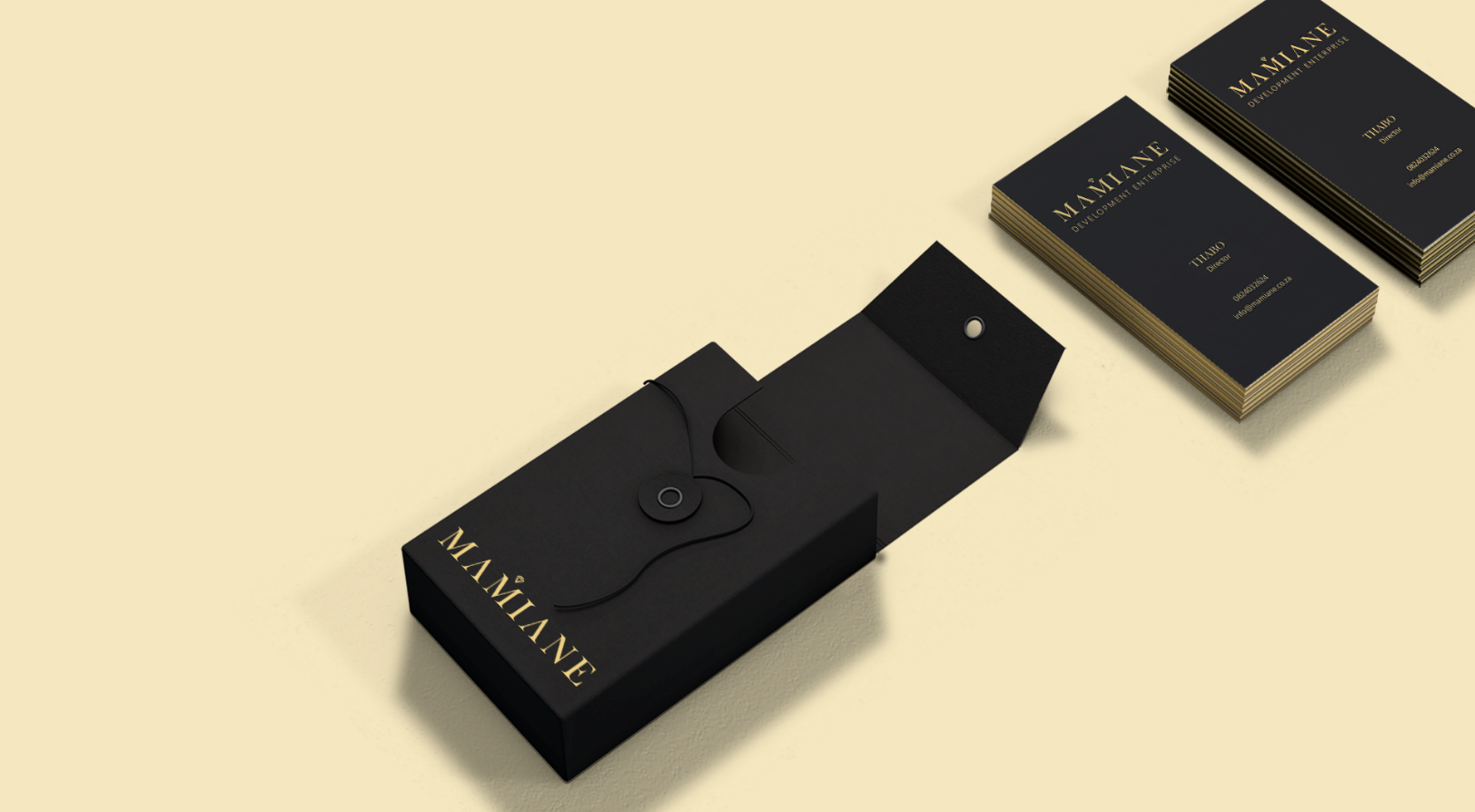
When designing the identity for the mining company we wanted to focus on the outcome over output - elegance over grunge.
Field: Construction, Engineering

Looking at the direction we went with we decided to maintain a classic look by designing the letter mark. The letter M is for Maimane. To ensure flexibility of the identity the same letter mark can be used in the wordmark ‘Maimane’ as a logo as well.
The diamond icon above the M was to distinguish the letter mark and act as a crown for royalty.